How to Color: Colored Pencil Basics for the Crafter
Coloring in rubber stamp images, coloring book pages or personal drawings using basic colored pencil techniques is a snap once you know the basics!

Learn how to color! Color pencil is a medium that can be used on a variety of white or colored paper substrates. Color is built up in successive translucent layers so not only will the color of the bottom substrate layer will have an effect on the color, colors are actually blended, intensified and/or altered with each pencil layer that is added.
While fine art materials can initially appear intimidating, one of the keys to success with these colored pencil basics is in practicing techniques, pressure, color combinations and strokes on a scrap of the same paper or cardstock that will be used for your final project. This takes ALL the pressure off from being “perfect” on the first try.
Practicing on scrap paper will also help you gain total confidence in your ability to use this medium and avoid some of the common errors. For example, it is important to learn how to draw pencil strokes in straight parallel lines instead of curves, as well as physically get the hang of adjusting the varying degrees of pressure you will apply to the pencil as you shade so you can predict (and control) the amount of color you lay down on each layer. And, when you use color pencil to color in stamped images or coloring book pages, the pressure is also off regarding drawing skills because the artwork has already been drawn for you!
Some color pencil artists maintain a journal or notebook where they document their layer order and process for achieving certain color blends and textures. In addition to practicing colored pencil techniques and pressure, these journals or notebooks serve as guides for subsequent projects while documenting each person’s unique color sense and drawing style.
Basic Pencil Strokes
You will first want to explore the different types of basic color pencil strokes. These are easy to do and can provide professional results in just minutes. While choosing which type of stroke to use can be a personal choice, each has a slightly different result.

Some of the basic strokes (a) side-to-side shading, (b) hatching with parallel lines to create texture and direction, (c) cross-hatching which combines layers of hatching drawn at right angles to create color and tonal intensity and variation, and (d) scumbling which uses tiny circular lines in various sizes and pressure to create texture.
The side-to-side stroke is a series of straight lines all drawn in a continuous back-and-forth motion, without lifting the pencil from the paper. It is the most common stroke technique and ideal for filling in solid color areas. Layers are built up with the strokes of color laid down in the same direction and angle.
Hatching is similar in that all these lines are parallel in the same direction but these lines are created by lifting the pencil after each stroke and then placing down again to begin each new line. Hatching lines can be close or far apart and anything in between.
Cross-hatching is a variation of hatching that combines two or more overlapping layers of hatching lines. Each layer is simply drawn in a different direction. This technique is used to create shading, as well as interesting textures.
Scumbling creates movement. It involves drawing a continuous curvy or circular lines without lifting your pencil while also relying on different pressures and line weights to create interesting texture and color variations.
Basic Color Theory
Since each layer applied using color pencil will affect the color of the layers beneath, it is important to understand basic color theory. Red, yellow and blue are referred to as “primary colors” and are the starting point for creating all other colors. The next group of colors (orange, green and purple) are called “secondary colors”. These are the colors we get when we mix equal amounts of two primary colors. And, when we mix all three primary colors together, we create brown.
It is when we begin mixing and layering colors in uneven amounts or proportions that color gets interesting. For example, when we layer and blend the three primary colors to create brown, we can create a brown that has a subtle yellow tone by using a little more yellow on the top layer or we can totally change the brown to appear more purple by using less yellow in the layers.
Color vibrancy can intensify with each successive layer but it can also be affected by surrounding colors. For example, if we place a green leaf against a red apple, both elements will “pop” and appear more dimensional. That is because red and green are what is called “complementary colors” and are positioned opposite each other on the color wheel. Each complementary color pairing has the color(s) the other lacks. Complementary colors can be used in layers to create vibrant shadows and other details that make drawings come alive.
Color pencils also come in white and black and in shades of cool and warm gray. These “neutral” colors are often used to help color objects like metal more realistically or to tone down other colors. The neutrals also play a large part in coloring nature elements, such as tree trunks, ground, or animals and are also used for adding highlights and shadows.

Basic Color Tips
- Layer primary colors (yellow, red and blue) to create secondary colors (green, orange and purple).
- Layer and blend all three primary colors together to create brown.
- Yellow + Blue = Green
- Blue + Red = Purple
- Red + Yellow = Orange
Colors opposite of each other on the color wheel are called “complementary colors”. Using contrasting complementary colors side by side make colors “pop” and appear more vibrant.

This coloring book page is being colored with overlapping color pencil layers that mix and blend to create unique colors in each section. Note the variations in green and brown. These tonal differences were created by using different color proportions.
These additional coloring tips and tricks will get you on your way:
- Choose paper surfaces that have a little “tooth” or texture as opposed to those that are totally smooth or coated. This gives the pencil strokes something to grab on to.
- Begin coloring image sections with a light base of the lightest color. Add successive layers of the same color to build color value intensity.
- For more realism in your project, create your shadows and highlights by adding layers of complementary colors instead of just using black and white.
- Use a colorless blender or blending tool to smooth out strokes and help blend layers and colors together.
- Clean pencil dust off your project with a soft brush. Use a light pressure to avoid smearing.
- Erase unwanted color by firmly pressing a soft eraser down and lifting the color off. If you rub with the eraser, the color pencil will actually burnish right into the paper fibers instead of removing the color.
- Practice, practice, practice!
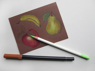
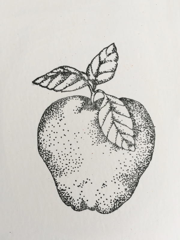
How to Color: Basic Color Pencil Tutorial on White Cardstock
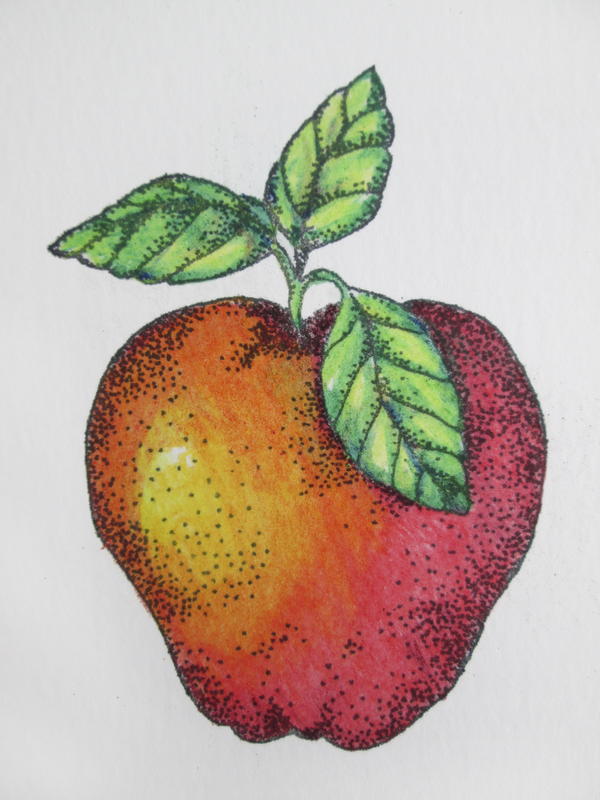
Materials used:
- Impression Obsession Rubber Stamps: E7728 Apple
- Clearsnap Holdings, Inc: Colorbox®️ Archival Dye Inkpad (Wicked Black)
- Derwent: Color Soft®️ Color Pencils
- Strathmore: Greener Options®️ Bamboo Card (or cardstock or fine art paper of your choice)
Instructions:
- Stamp image on white cardstock using a dark grey or black dye ink; dry completely.
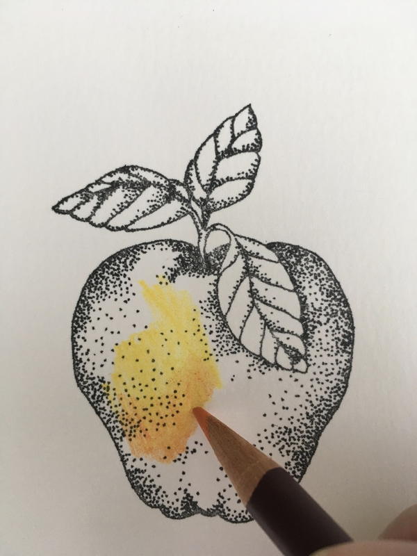
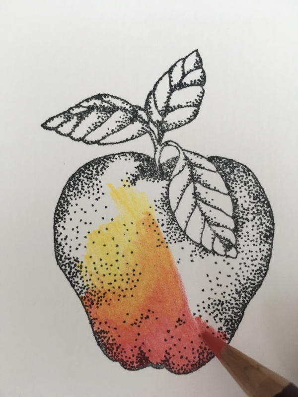
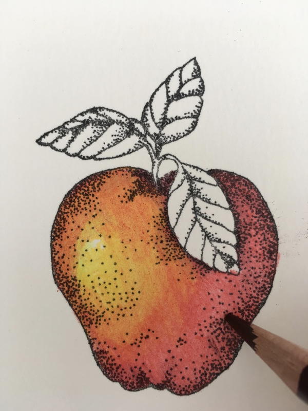
- Lightly stroke Cadmium yellow onto apple, reducing pressure toward the center of the area. Add a second crosshatched area of yellow. Add an orange layer next to the yellow section and blend the orange strokes into the yellow.
- Continue with warm red strokes that blend into the orange. Apply the color in layers by combining side-to-side shading and various angles of hatching and cross hatching strokes.
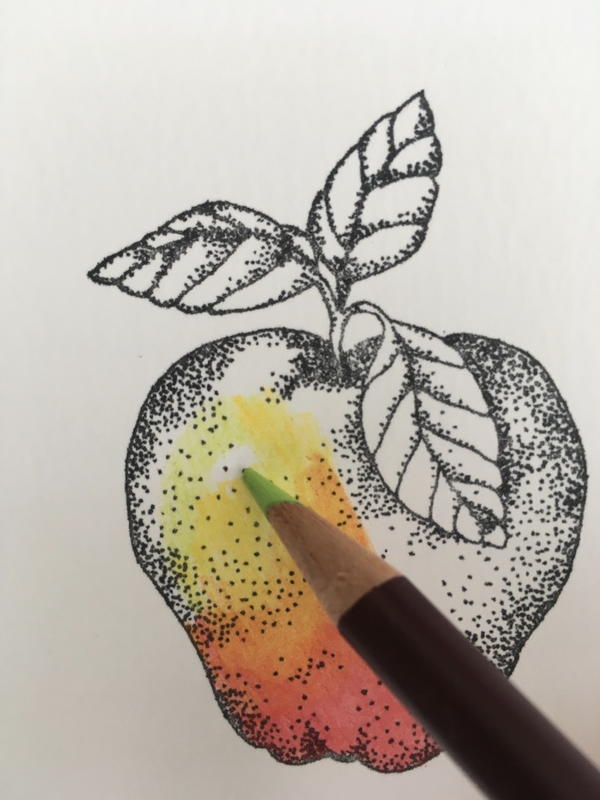
- Add a few strokes of Lime green near the yellow and blend to soften the transition.
- Fill remaining portions of the apple with warm and cool red as desired, building layers to create subtle color variances.
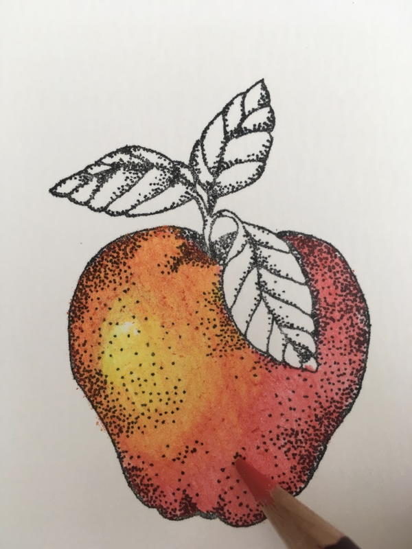
- Add shading along the sides of the apple with a combination of a deep Carmine red and Indigo blue. Add a touch of green under the leaves for a rich complementary color shadow.
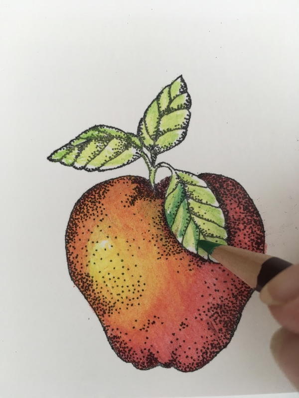
- Color leaves by building partial layers of various shades of green from lightest green to darker green.
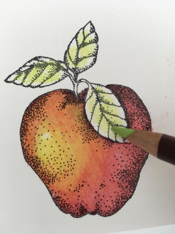
- Add Indigo blue along leaf edges to create shadows and contour.
What challenges do you run into when you're coloring? Let us know in the comments!