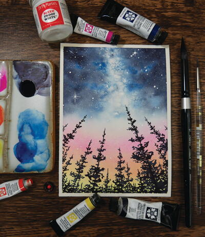
Nighttime in the Towering Forest

The sun has disappeared beneath the horizon, leaving brilliant colors in its wake as night slowly spreads. You take a moment to breathe, glance up and view the magic above the towering pines. In this painting, let’s discover how the use of rock salt can add incredible texture to our galaxy sky.
Materials List
-
Paints:
- lemon yellow
- Pyrrol orange
- Opera pink
- Prussian blue
- Indigo
- Brushes: sizes 12 and 2 round
- Paper: 5 x 7–inch (13 x 18–cm) cold-pressed watercolor paper
- Painter’s tape (or washi tape)
- Paper towels (or a rag)
- Ruler
- Pencil and kneaded eraser
- White gouache and/or white gel pen
- Rock or kosher salt
INSTRUCTIONS:
-
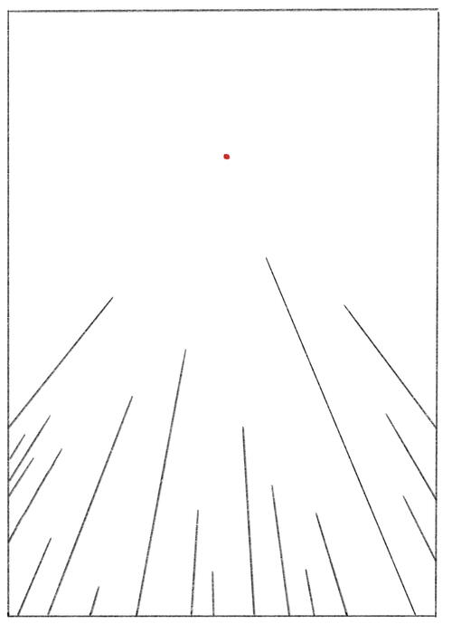
STEP 1: THE SKETCH
We’ll be employing the use of one-point perspective in this painting to make it appear like the pine trees are towering overhead. I love using perspective in pieces like this because, when viewing the piece, it feels as though I’ve stepped into the painting.
For this sketch, place your vanishing point in the center of your paper, about one-third of the way down from the top. For a more severe perspective, place the point lower; for a less severe perspective, place the point higher on the paper.
Then, using a ruler, draw in straight lines of various sizes, the “skeletons” for your future pine trees. Make sure your ruler passes through the vanishing point every time you draw a line.
Once your sketch is complete, you can lighten your pencil marks with a kneaded eraser if need be, but, for this piece, I suggest leaving the marks a bit darker than other projects in this book. We’ll need to be able to see these pencil marks to paint our pine trees in the correct perspective. -
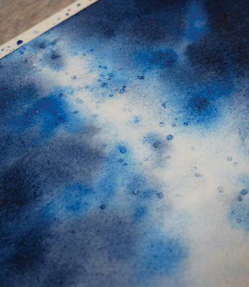
STEP 2: THE FIRST LAYER
For this piece, we’ll be combining a gradient sunset and a galaxy sky, all using the wet-on-wet technique and strategic layering.
That said, start off by wetting the entire paper with clean water. Once glistening, use your size 12 round brush to apply a sunset gradient, starting with lemon yellow on the bottom, pyrrol orange in the middle and opera pink on the top. My suggestion is to use light or medium values for all three colors, as we’ll be adding saturation with each layer. This three-color gradient should stop about halfway up the paper.
Then, starting from the top of the paper, let’s outline the white portion of our galaxy. Using the same brush, apply light-value Prussian blue to the paper with loose strokes, leaving plenty of white space in the middle of the paper and in between strokes. We’ll need that white space to create luminosity. Then, clean off your brush, and apply light-value indigo surrounding and in between your Prussian blue. The use of indigo surrounding our galaxy and in the corners of our painting creates depth.
Another key here is to leave a portion of white space just above the opera pink. This prevents the opera pink and Prussian blue from mixing too much and creates an additional glow that our galaxy rises out of.
Let this layer dry completely, and then move on to the next step. -
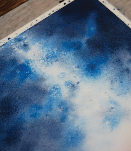
STEP 3: THE SECOND & THIRD LAYERS
Because of watercolor’s transparency, the key to creating vibrancy and depth in galaxies is the use of multiple layers. So, let’s repeat the steps of the first layer. Rewet the entire paper, and add the same colors in the same spots.
In the galaxy sky, paint in more Prussian blue and indigo, increasing the values. Drop in some Prussian blue and indigo in the white portion of your galaxy sky, replicating the dust of the Milky Way band.
Let this layer dry completely. Then, repeat the entire process again for a third time. Once you’ve painted your third layer, move on to the next step before your paper dries! -
STEP 4: THE SALT
Salt reacts rather uniquely to watercolor paint and creates textures perfect for galaxies! While your paper is still wet, drop in a few pieces of rock or kosher salt in the white section of your galaxy, and sit back and watch the magic! Don’t remove the salt until your paper has completely dried.
Salt acts as a “resist” of sorts, pushing the pigments away to create a lighter spot around the salt grain. Different sizes of salt will create different effects, so feel free to experiment with table salt, sea salt, kosher salt and more! Moreover, different paper textures will also impact the salt texture you achieve. When you paint on cold-pressed paper, the pigments fall into the rougher texture, and the paper almost acts like a sponge. When you paint on hot-pressed paper, the pigments tend to float on the surface for a longer period of time before absorbing into the paper. Due to this, the salt effect on hot-pressed paper will be lighter, with more paper showing, compared to the effect on cold-pressed or rough paper.
When your paper has dried completely, remove the salt by rubbing it away with your finger. -
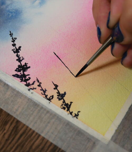
STEP 5: THE TREES
Time to add in our towering forest! Using your size 2 round brush, load up some dark-value indigo, and begin painting pines of various sizes using the blobby technique. Make sure to follow your pencil marks from the beginning, as they should be visible beneath your sunset gradient. Following these sketches will ensure that you achieve the proper perspective. -
STEP 6: THE STARS
The final step in any galaxy painting: Let’s add in the stars! Cover up any portions of your piece where you don’t want stars with scrap pieces of paper, and then use the spatter technique to add in your stars.
Once you have a spattering of stars, load up your size 2 round brush with white gouache, and add in a few extra stars of varying sizes. In galaxy pieces where I’ve used salt, I love to add in a few stars in those light sections left behind by the salt grains. The texture surrounding the white dot from the salt makes it look as though it’s glowing. Additionally, add in a few twinkling stars as well! For realistic-looking stars, make sure your “compass lines” are of varying lengths. I also added in a couple of stars within the sunset gradient—these are brighter stars in the sky that can shine through the fading light of the sun.


Credit:
Reprinted with permission from Stunning Watercolor Skies by Rachael Mae Moyles. Page Street Publishing Co. 2023. Photo credit: Rachael Mae Moyles.
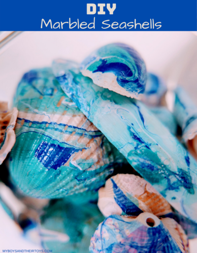
Read NextDiy Marbled Seashells